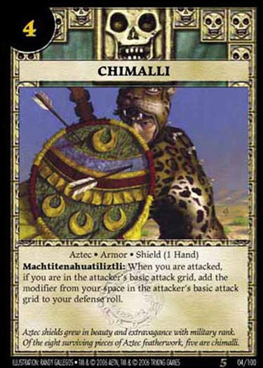
Chimalli (2005)
Artifacts outside of Magic
This post is public, so feel free to share it. I hope you’ll consider joining with a paid subscription to see new posts every weekday.
For a couple of years I had the pleasure of working on the Anachronism game, which carried The History Channel’s license. I’m interested in history in general, and find it to be every bit as exotic and exciting as fantasy. Certainly, fantasy art would be much poorer if it didn’t draw so heavily from history itself.
For the 5th set, I chose to do some work within the Aztec culture, doing 5 pieces themed around Auitzotl, the great Aztec ruler and father of the more infamous Moctezuma. One of the five was a portrayal of a Chimalli, or type of aztec shield.
History buffs are probably tied with hard-core fantasy/science fiction fans for being eagle-eyed. Getting something wrong in either is bound to get you hogtied. This must be balanced against the constraints of illustration in general, namely, time. So work began with a lengthy all-in-one research session.
I researched the elements of all five illustrations at once. I paid particular attention in this case to illustrations rendered in various codices illustrated by the Spaniards in the 16th century. This is problematic for a few reasons, but the main reason for an illustrator is that the drawings made were often quite primitive. case in point:
Putting together the information gathered from various sources, and taking into account the occasional museum photo and some more modern portrayals of these things by other artists, I eventually had a good overview of the items I needed to illustrate, as well as knowledge of gaps I’d need to fill in as reasonably as possible. History is difficult for just this reason: we end up having a small selection of artifacts and often assume they are the only things that existed. Where the record is incomplete, an artist must extrapolate to some extent. This isn’t so much excuse-making as there were few places where this was necessary, but establishes the problem an illustrator faces when legitimate information fails to inform all the aspects required for the painting.
With history it’s important to have all the reference before you begin concepting, quite a reversal from fantasy and most other artwork where you normally conceive an image and then find relevant reference. This is because you don’t really know what needs to be portrayed until you’ve checked it out…and sometimes you’ll find requirements that you hadn’t imagined which can wreck a pre-conceived composition.
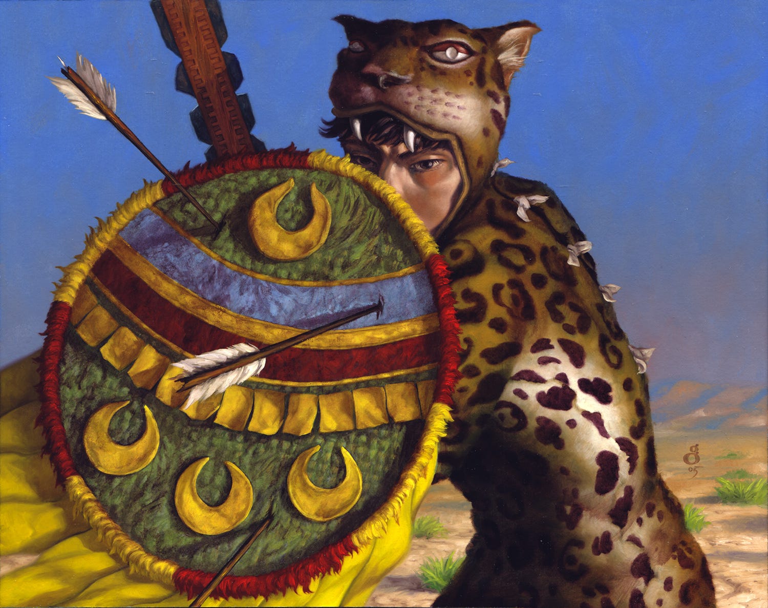
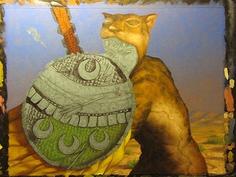
Chimalli represents what is now known as an “artifact” image among Magic artists: an image portraying a specific object, in this case, the shield. Some attempts at artifact images portray the object simply. Examples would be a sword on a rack, a book open on a table, and so on. I’ve used this approach myself in the past, particularly when asked specifically to do so. More often, I prefer to inject a human element into the piece—after all, objects are often used by people or in relation to people, and viewers react positively to seeing other people portrayed in art. So in this case rather than show a Chimali so up close that it took up the full frame, I went for the Chimali in use. Of course this necessitated researching the jaguar warrior who in this case would wield it, leaving double the room for being called on for errors, and double the research! Chimali, to my understanding, were used primarily for batting away arrows, not repelling blows the way metal shields might. However, I figured that eventually some arrows would stick, particularly because of how the Chimali is constructed. There was my concept, and it was ready to go.
Putting it all together I produced the following drawing, which I quite liked.
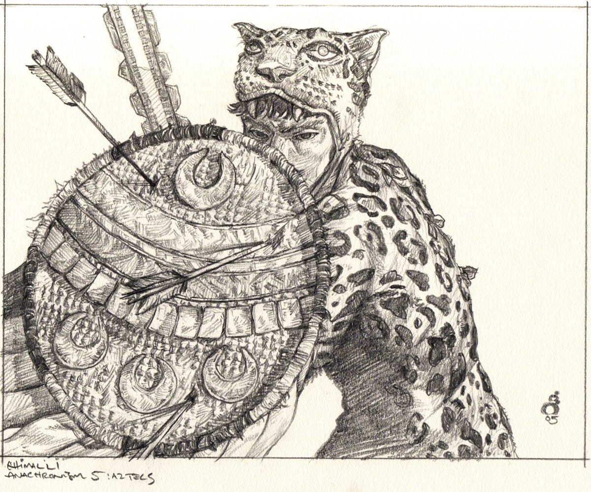
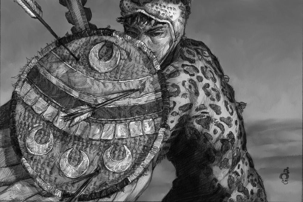
I scanned the drawing and popped open Painter. I made the drawing a ‘multiply’ layer and painted on a normal layer beneath it using a custom oil pastel brush that ended up most closely mimicking oil paints according to my style and usage. I quickly knocked in grayscale/value. I wanted the environment to be indistinct.
One reason I settled on tighter drawings is because it will often be the actual base for my painting. Typically this means printing out an enlarged version on the stock I will eventually paint on. I enlarge the drawing then use my printer to print it out, meaning I get to use the actual detailed drawing and yet preserve it separately rather than lose it forever under paint. I use only black ink for this purpose because the color inks are probably more fugitive and will fade away more over decades. I don’t print it very dark because I don’t want to use the blackness, I want to completely cover the ink with paint. Again, if I only lightly paint over black areas because they’re already so dark and then the ink fades away in 50 years, the painting is going to look terrible. Some newer printers use “archival” inks and I use these now but my habits haven’t changed as I don’t trust them, and neither will I live long enough to see how those inks hold up after a hundred years or so. So the drawing is printed lightly and is completely obliterated by full-coverage paint so that if the ink goes, nothing changes. I often use Ampersand Hardbord as my support. I wet-mounted my drawing to the board. Various artists use various adhesives but I have tended towards using PVA glue which is a lot like Elmer’s White Glue but fully archival where Elmer’s has some impurities in it. I then seal the paper and get painting. I’ll expand on more of these stages eventually.
But painting is the fun part. I enjoy the actual painting much more than any other step, including the drawing. Before beginning the jaguar suit I painted the spots darker so that they’d show through the fur as I painted it (as mentioned, the drawing wasn’t that dark and wouldn’t have survived the painted fur). I then went back and painted the spots over the homogenous handling of the fur in general. You can see that I re-painted the drawing on the shield too for the same reason—I wanted the details from the drawing to show through when I applied the major colors. I don’t always do that, as my techniques are a little fluid, and further explanation is probably in order since words do not easily convey the process, though a good painting teacher or book might be able to explain the methods for painting pattern and texture. You’ll note I changed the background from a sky that got lighter as it went down to one that got darker with more brightly lit ground. This was a fairly on-the-fly decision.