

D&D: Elemental Anchorite (2011)
My favorite D&D illustration?
Please enjoy today’s public post. I hope you’ll consider joining with a paid subscription to see new posts every weekday.
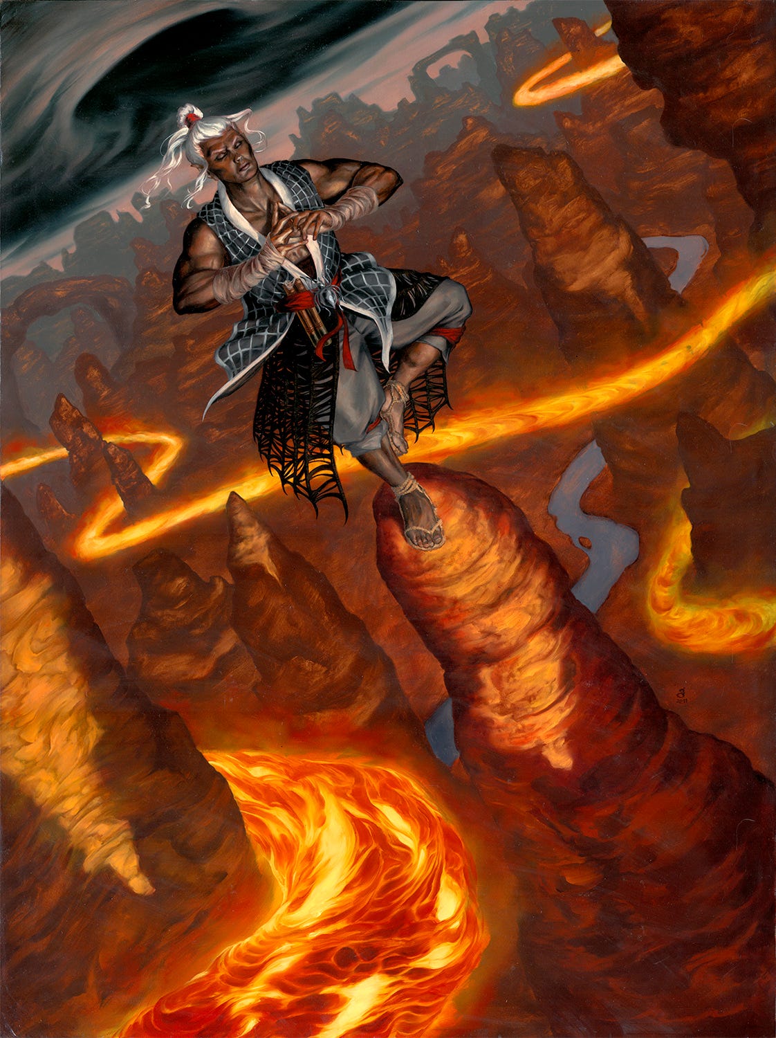
I do enjoy environmental pieces. Sure, they take longer to do and have more elements in them, but they are a welcome break from more iconic pieces with minimal background. I like both types of imagery, really. There just aren’t as many venues for full-on environments. Dungeons & Dragons is one of those brands that routinely benefits from them.
It was also a rare opportunity to paint a character from the game’s renowned Drow race. In this case, I was to portray a monk-type of Drow, meditating on top of a cliff or bluff or something, in a landscape that could be like a western USA rocky landscape (Pinnacles National Monument, for instance), magicked-up.
Naturally, I loved the idea of a grand vista piece. Though this was going to be a vertical piece, I actually started thinking panoramic, and originally intended to paint this wide, indicating a vertical area that would serve as the illustration, with the rest just being, “For me.” This wouldn’t be the first time I would have done something along these lines--it’s not uncommon for me to get carried away with an idea, painting more than is required or will be seen by the general public. I do tend to think of my paintings as separate entities, serving different purposes than the illustration.
Some of my initial thumbnails indicate this:
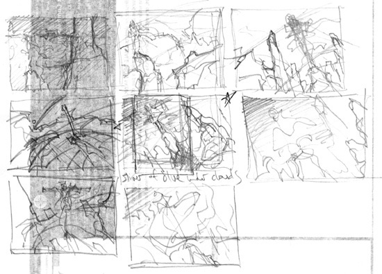
They’re of course a little hard to read (they’re thumbnails), but of note is that they’re all horizontal. The top-right one is a view from slightly below, looking up, which would have featured an expanse of sky above, and the fingers of rock formations peeking up. I would have used a similar setting-sun lighting, with the bottoms of the formations cast into final-daylight shadow. The middle-left would have a very long view towards the setting sun, most of the formations rear-lit and in shadow. From the looks of it I had a sort of fish-eye effect going on, with the figure standing atop and above the horizon line. However, it suffered from the fact that it would’ve been odd to have the figure face away from the sunset--though not impossible--and it’s generally a no-no to face away a single figure.
It’s a little funny, looking back, that for those two thumbnails in particular, they immediately trigger in my mind the finished pieces. I can see in my head just what they would’ve looked like. Not so much the others. In that sense there are two more paintings on this theme which may end up staying in my mind forever, with no reason to get them out now that the job is done. That upper right one still calls to me—perhaps it’s a case where one day I may be able to repurpose the thumbnail.
Perhaps most notable was the diagonal thrust to the horizons on most of these. I did a few others before this set, they just sucked more--often you have to draw out the bad ideas before the good stuff starts flowing. I think I liked the slight feeling of vertigo or not being quite as balanced standing up as high as the meditating monk. I mean, I don’t know how you as the viewer got up there to see this scene, but I doubt you’re nearly as comfortable standing up there.
In the center of the thumbnails, you’ll see one with a vertical frame drawn into it, and a star. That was my choice. I had been thinking this piece would probably have been 24x36” given the thumbnail--much larger than usual for me, and wholly unnecessary as far as the client was concerned. I didn’t have enough time for the whole project, given how much I was already scaling-up, and the total fee. I was already running well-over the allotted time:money ratio, actually. But I was really excited and interested in going above-and-beyond.
So, I decided to draw that frame and crop this to 18x24”. Had it continued, it would have looked exactly like this, height-wise, but just had much more on the sides. Even now, I shed a little tear that I couldn’t do it. I considered starting the whole piece but only finishing the part the client needed, thinking I might finish the extra parts later, after the project was finished. But I also figured I’d lose the spark of interest, or be so busy I wouldn’t get to it for a long time, or never. In any case, I made the hard choice--still make it a larger-than-needed piece, just without the wide format.
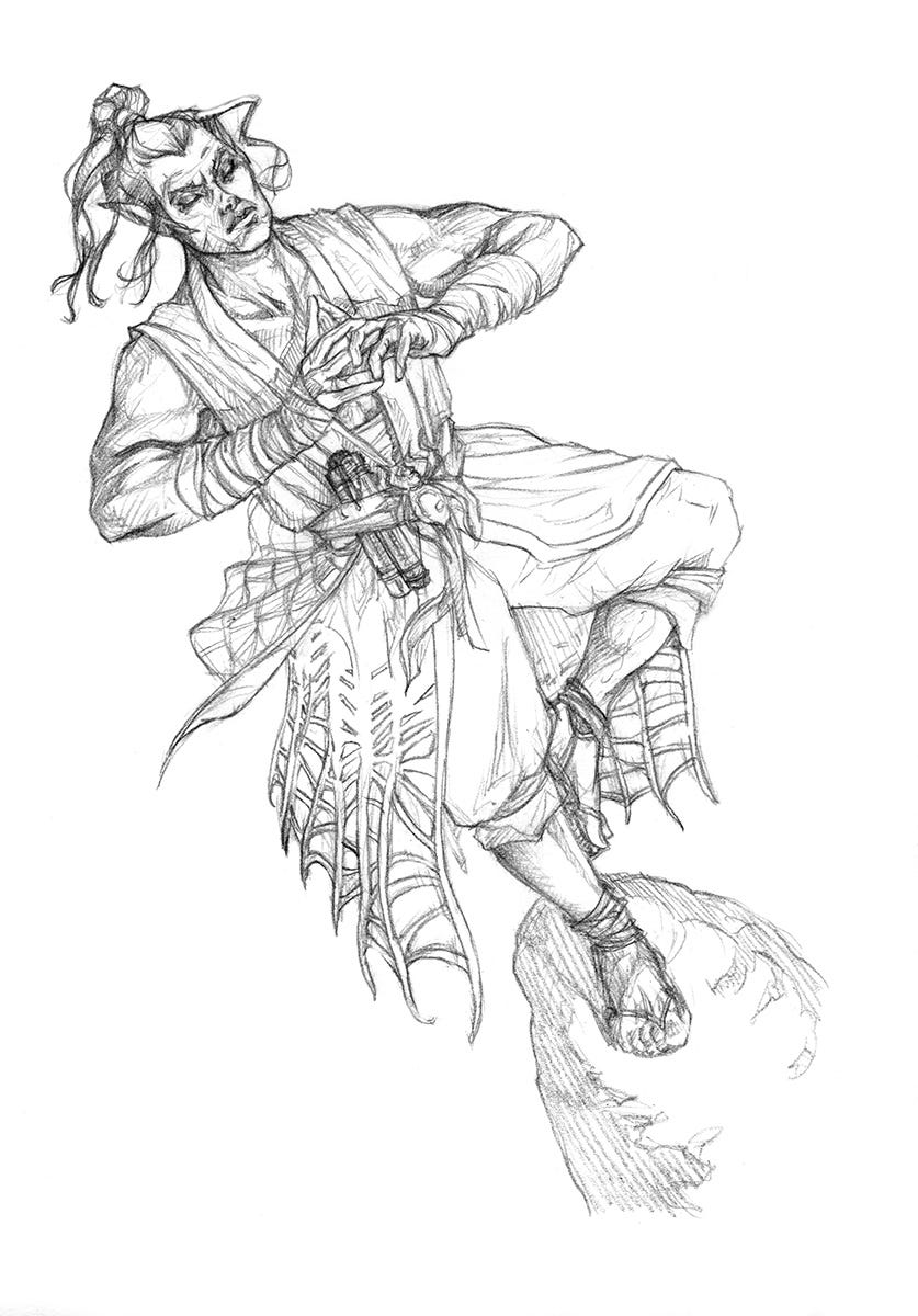
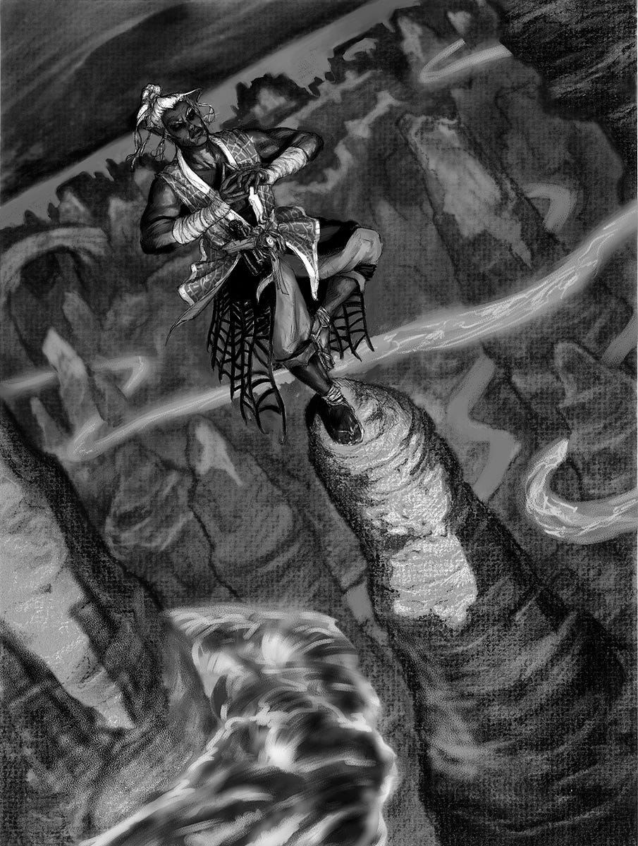
A good AD is a collaborative partner. My first sketch consisted of this same charcoal study, with that roiling inverse-funnel in the sky, but not so much in the way of lava. The monk was also an older character, a wizened old figure. I thought he might be a little too old, and Mari Kolkowsky my AD agreed. She also suggested the floating lava flows. In the end, those suggestions really helped the piece snap together into something better. I redrew the figure, composited things together digitally, got the ok, and went to work!
For pieces like this, it’s quite natural to paint distant-to-near, in terms of the overlapping forms, which is what I did. I recalibrated the value study from what’s above here. If you squint at the final, you’ll notice that the shadow area for almost all of it except for in the 3 forward most pinnacles is basically the same value. I think the most distant areas are maybe 15% darker or so. That’s a really narrow band of value to play with, and it was meant so that the complexity of so many overlapping forms would not complete with the figure, which it’s starting to do in the sketch. To push the atmospheric perspective, then, I relied on graying out the color as it proceeds back, and collapsing the dark-to-light spread, so the light areas get successively brighter as you get nearer. It was a challenge to restrain myself to that short a band of variation of light-and-dark with so many forms to render. But I was happy with the results. In the nearest area, I pop more darks and lights to really separate it from the mass of the rest of the landscape.
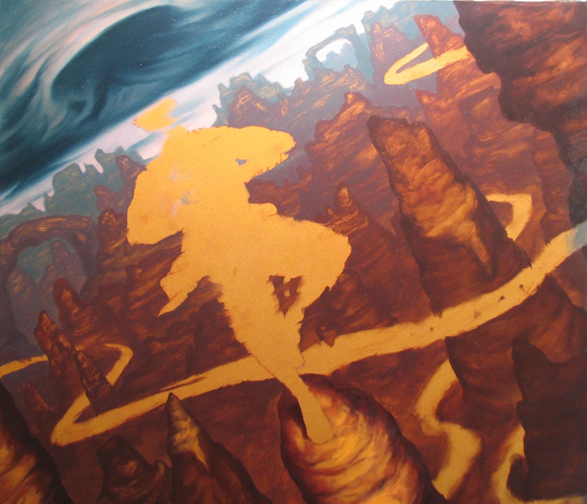
Elemental Anchorite appears in the 4th edition sourcebook, Heroes of the Elemental Chaos