

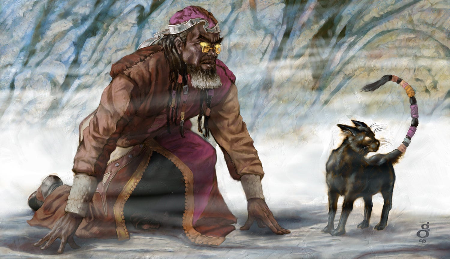
D&D: Vale of Smoke and Fog (2006)
Meow
Please enjoy today’s public post. I hope you’ll consider joining with a paid subscription to see new posts every weekday.
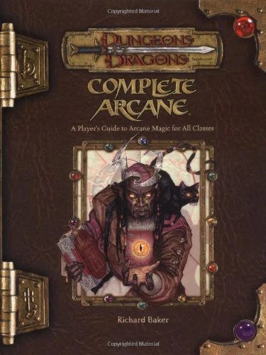
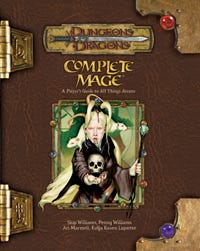
It was less common in those days to have to illustrate pre-existing characters within Dungeons and Dragons. In this case, the excellent Matt Cavotta had done a run of covers for a few D&D sourcebooks, including the one today’s illustration appeared in. In our case, the previous book, Complete Arcane, featured this character on the cover:
That character was assigned in this illustration as a spot illustration, to appear within a misty environment and his cat familiar.
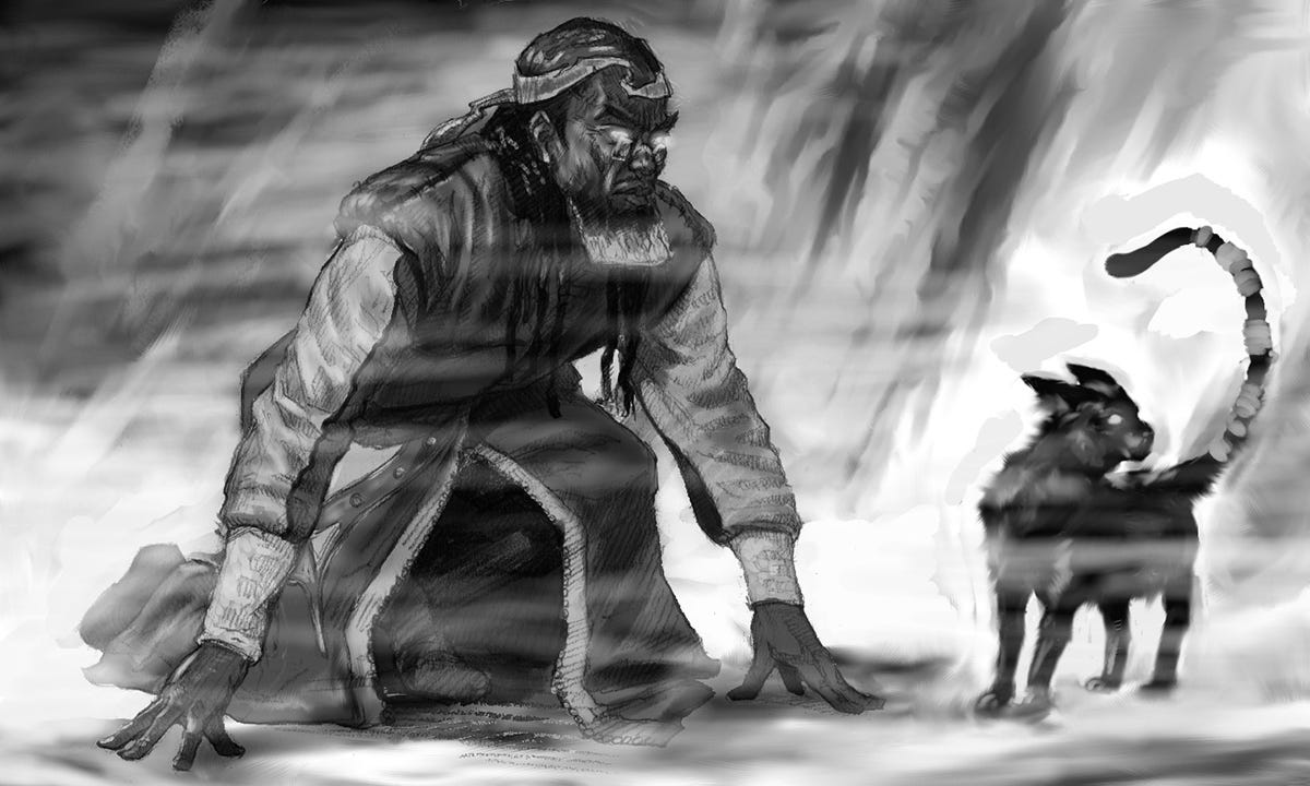
At the time I was primarily using Painter IX, and was still pretty new to digital art with my screen-less drawing tablet, and often used digital ink and rake brushes to produce thumbnails. It was in this period that I started incorporating value* into my thumbnails more.
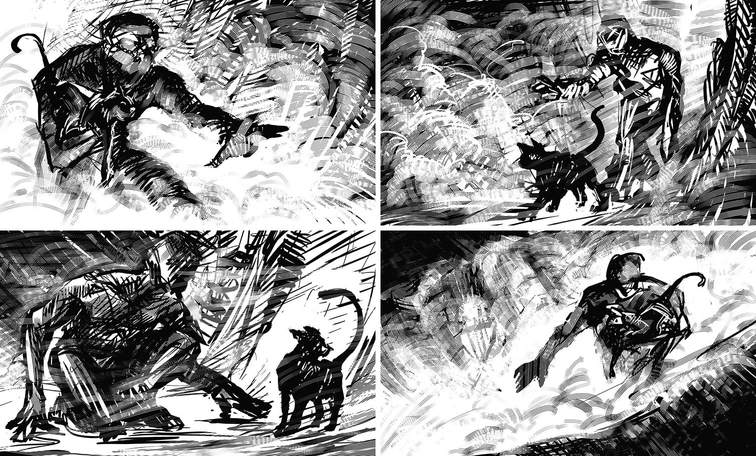
It’s hard to go back and remember why I chose one composition over another, when there were multiples I liked. And it’s not uncommon to look back later and think I probably should’ve chosen a different one. Of course, I know what the one chosen developed into, and it can be tempting to think an alternate might’ve resulted in all the best choices. Grass is greener, for art.
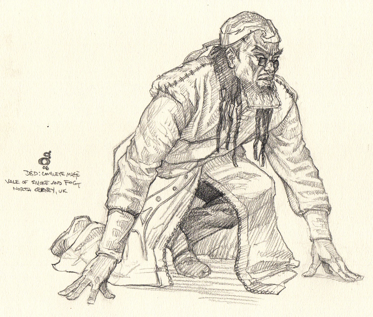
In this case, I only worked out the figure in pencil.
After which I put together a study for submission, which was a little vague on the environment, still.
From there, we were off to the races. I didn’t always save off in-progress copies, but I think there was a software bug I was dealing with around this time that motivated me to do so, so I happen to have some.
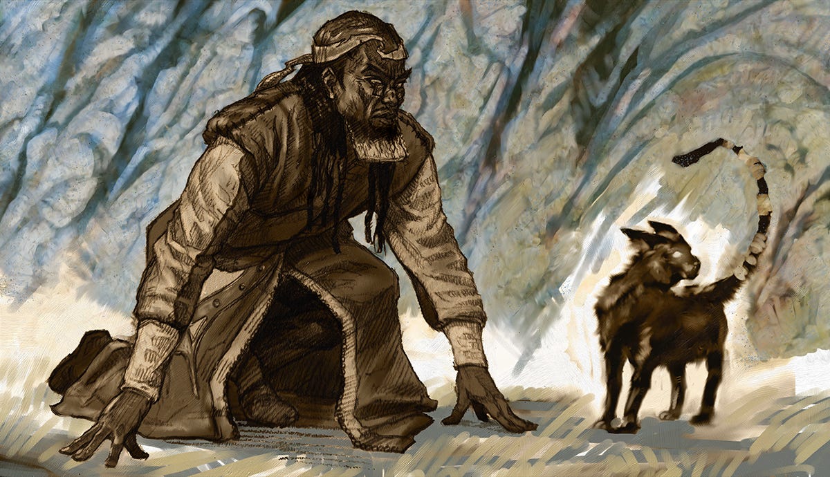
I began by dumping a sepia over the value study I submitted for approval. I probably grabbed some stone texture and laid if over the background, then began overpainting on it, likely starting with using “Color” adjustment layers to tone in cool colors.
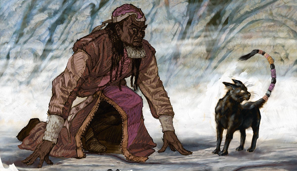
Much of the background had been established here, as well as the cat. I have likely collapsed my layers—it’s so easy to keep tons and tons of layers, and I hate working in that environment so I try to collapse layers down frequently, sometimes saving off the prior version in case I need to revert, but often not doing so. So I’m beginning to block in the figure here, and you can see I’m using chunky strokes here, more like one might apply physical paint. It was difficult to transition to digital painting because the medium favors certain handling approaches, but over time I kept trying to shift it back more to my painted look.
It’s usually in the blending stage where things can gain their, “Too digital,” look. Digital blending is often so smooth, particularly because the blending tools tend to ignore the texture of board or paper or canvas, so they look synthetic. But there are more strokes left here than typical for the era. I was learning my way.
*value: the relative lightness or darkness of a color, in this case the thumbnails were indicating light and dark areas, whereras quick pencil doodles usually just focus on shapes of figures and such without any shading which might indicate any dark/light arrangement.