Dismas, Fallen (2020)
Come, let us go on a journey….
Please enjoy today’s public post. I hope you’ll consider joining with a paid subscription to see new posts every weekday.
Picking an interior spread to double as a cover for our prior book, The Spider Who Saved Christmas, was a cinch from the initial read. Here, for The Thief Who Stole Heaven, it was a little harder as most of the scenes featuring the titular anti-hero were narrative, so he was mostly interacting with other characters, and none of them had anything like a cover-moment or iconic feel.
The third spread, however, introduces Dismas as an adult, after a few pages of his boyhood, where he was being trained up in his evil ways as a street urchin under the sway of a criminal named Gestas. This spread’s words were few, and it gave me a potential for a more simple portrait-type scene, and was our best bet. We were under another very tight deadline, and though I would have preferred to recommend a standalone illustration that would only be used on the cover, to free us from needing to re-use an interior, there was no time in this marathon, and this was a decent option.
We all learned some lessons in our second foray together, so with return book designer Carolyn McKinney, who I can’t say enough nice things about, we had some advantages. She joined us from the start this time, and I asked her to provide me with a rough blocking of the text per spread before I even started. This allowed me to gauge the room I’d have to compose things; last time since she was brought aboard the project late, it meant otherwise unnecessary revisions to make room for the actual text.
With this blank text-only dummy, I was able to rough out the entire book. I was free to move the blocks around a little, as they were only her “sketch”, as it were, of the text placements. Roughing out the entire book allowed the author (who doubled as Art Director here, again) to see the flow of the visual narrative, and we could discuss the project as a whole. I did this last time as well, but with Carolyn helping from the start, things went much more smoothly on this front.
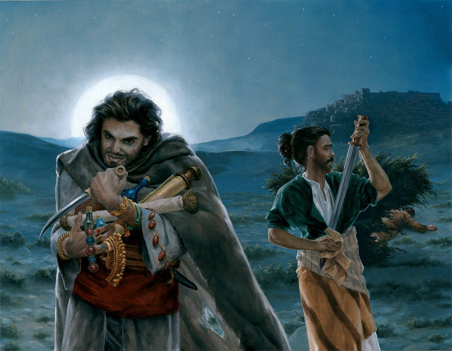
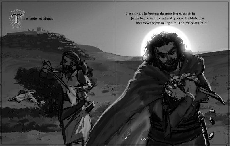
It was Carolyn actually who recommended flipping the illustration, which was a great idea, as it put Dismas’ first adult appearance right under the sad, terse sentence, “Time hardened Dismas.” I had other reasons to compose it as I did, but her instincts were correct, I think.
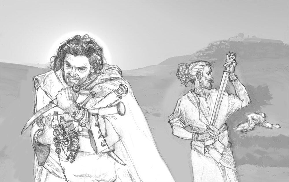
From here, I added the additional step of rendering out pencil studies of everything, then putting together another dummy for presentation. Interpreting the very rough sketches is sometimes a little tricky. Last time we didn’t have the time for the more detailed drawing step, and there were some surprises going straight to final from roughs that required revisions on my part. For most of my illustration over the past 20 years, I’ve use very tightly drawn sketches to avoid just those surprises. You see that constantly at Art of the Day here. Though I had a few more weeks total for this project, a lot of it was used to add in these more detailed drawings as an in-between step.
We used the earlier roughs to approve the overall value structure (light and dark patterns) and basic composition. We used the tight sketch stage to approve the characters themselves, only. Flipping the composition, and again not paying attention now to the dark/light patterns, we arrived here:
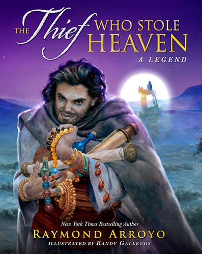
My notes indicated that this would be a last-light sunset scene. I had a visual narrative arc that began the story in late afternoon and proceeded to night in the following spread, mirroring Dismas’ descent as a criminal (the time-of-day arc continues throughout the book as a consistent thread). The author did not like the idea of the golden sunset cover I initially proposed this as, and asked me to move this to moonrise, already night. Simple enough, so I went to paint.
The painted art appears above, but knowing Raymond’s tastes, that desaturated sky was painted as I prefer. The spread in the book and the cover as I initially proposed it features some additional color, added digitally, as shown below.
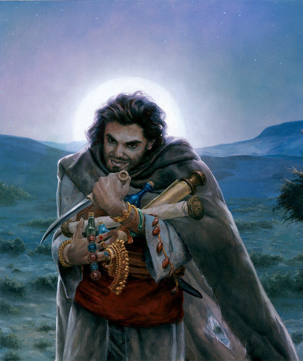
This then was the cover as it was first submitted. It was among the first spreads finished so they could do their cover work, and I continued with other parts of the book. I then heard that the buyers were not very thrilled to have Dismas holding a knife on the cover, and thought the cover needed more color. To be honest, I kinda thought so too—that’s part of why I had recommended a sunset from the start. Shifting it to moonlight necessarily reduced the breadth of color.
I wasn’t much involved in some of the conversations that happened, but this is not a happy children’s story (spoiler alert: it ends with people hanging from crosses). Raymond did not like the idea of de-fanging Dismas, and though I agreed, it was agreed that we should probably try to make the buyers happy since they, you know, buy the books for the bigger chains.
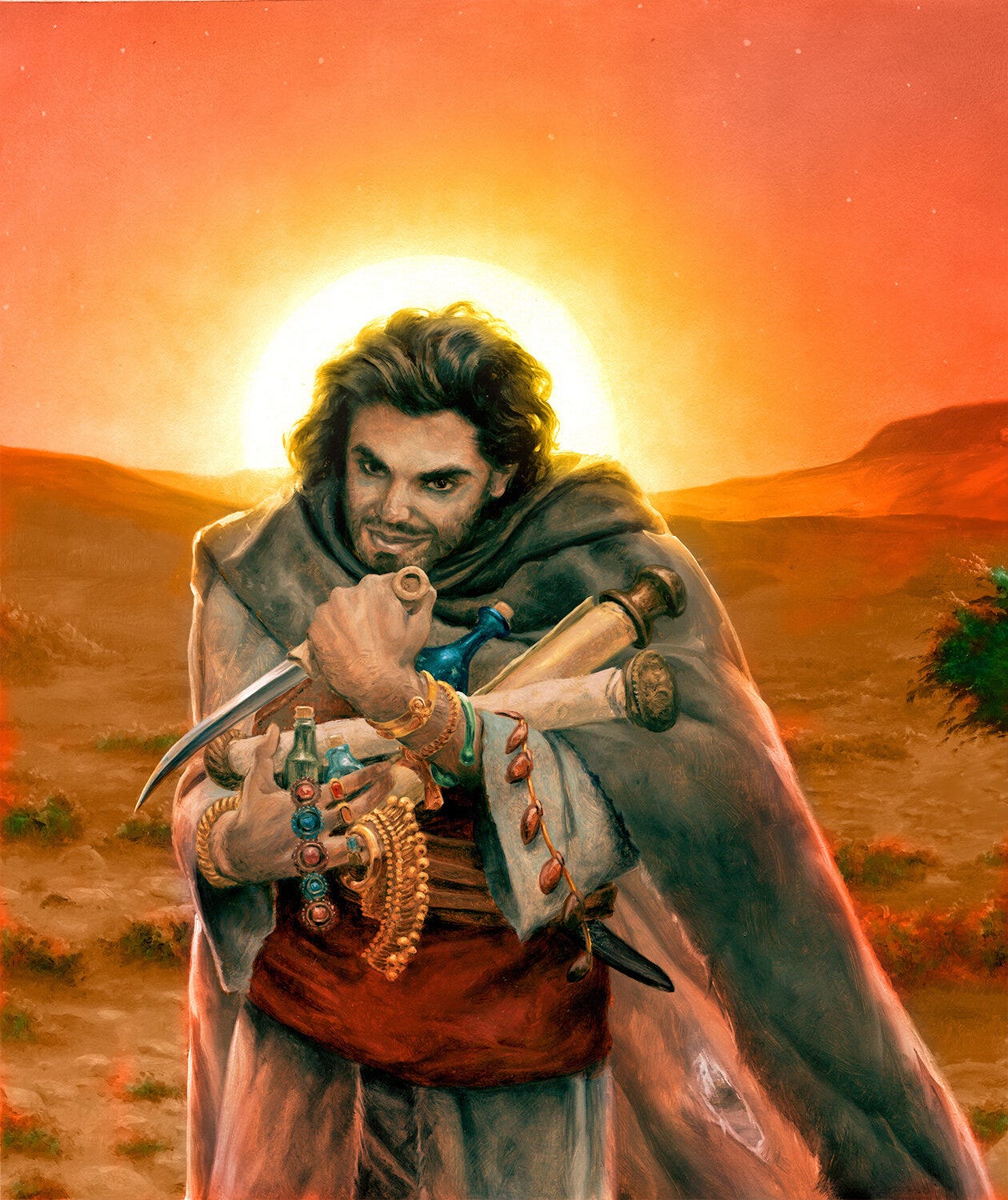
There was the color issue still. I proposed that we revisit the sunset idea and did a digital mockup of what that might look like. A little clunky but gets the idea across. It would have been best to paint it rather than try to color grade it, but in a pinch it worked and I would have done more to unify things had we gone forward.
In this case, Raymond was able to see what he thought he would not like (sunset colors), and confirm that he did not like it.
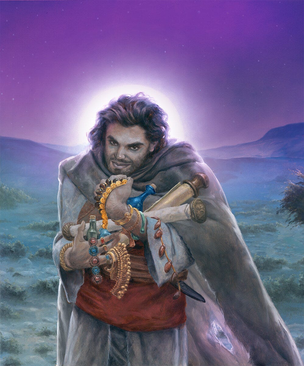
We talked more about it and it was decided that I stick with night but deepen the coloration more and inject some purple into the night sky. These were things I didn’t love, but this was all outside my hands now. I worked on that, and reworked the hand and knife situation, delivering what I thought would be the final revision.
Interestingly, the slightly saturated coloration of how I sent in the original cover was the coloration that we used for the interior spread. It was fine for that purpose, but the intersection of the buyers’ tastes with the author’s vision meant the cover was going to be its own thing.
At this stage I started seeing the book designer begin to pass title text treatments back and forth and start putting all that together. I was by now in the home stretch on the rest of the book and it was all coming along nicely. Everyone was very excited to see the project taking shape, as Carolyn was inserting art into the book and finalizing her interior text and sending PDFs of the book in-progress around for review.
Once all the art was in and I was doing some last-minute tweaks on things, I received another request. On another spread, the Holy Family is tiny and visible in the silhouette of the moon as they come over a hill during their flight to Egypt (this story and Spider intersect). Raymond really liked the idea of bringing that piece into this one. But Dismas’ head is haloed by the moon here (intentional, and mirrors another illustration later in the book as another meta-narrative I had put into the visuals). So, I was asked to move the moon off to the side to swap in that little vignette, and to darken and deepen the sky even more. With that, the project was put to bed and Christmas was celebrated by all as the end of the year rapidly approached.
Again, it’s interesting to note how many of these changes were required just for the cover. The interior reads in the initial way.
Cover drama aside, I was happier overall with the art for our second book together. The bit of extra time I had and the established work partnership between the three of us allowed me a much smoother process overall and just that much more time to bring things more in line with my vision for an illustrated book.