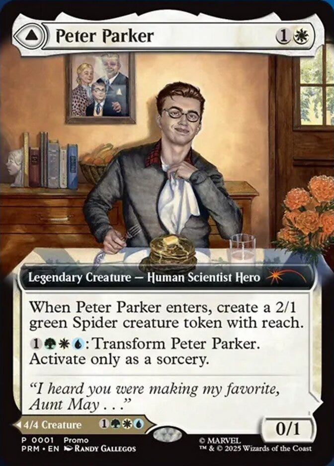
MTG: Peter Parker (2024)
An Unexpected Sequel
Please enjoy today’s public post. I hope you’ll consider joining with a paid subscription to see new posts every weekday.
The original art for Peter Parker is available for purchase.
The second wave of assignments for this project were a few months after the first, and I got one card to do, though it was a double-sided card. Seeing the assignment name, “The Amazing Spider-Man | Peter Parker,” I did a double take. I understood that the entire Spiderverse was going to get representation in this set. I did not necessarily expect to illustrate any of them, and certainly did not expect to get one of the more iconic portrayals. That I was being given permission to paint these traditionally when these crossover IP sets are otherwise always digital-only, was a truly special occasion.
Parker was described as being related to his earliest portrayals, and he was to be eating wheat cakes in Aunt May’s home (with references given of her home from the era). While it wasn’t stated explicitly, I immediately decided to rotate the camera from the Aunt May illustration, and make them one. This was perfect since the implication in Aunt May’s composition was that you were at the table with her, that perhaps you were Peter. In that sense, this would almost have made a better flip card with May.
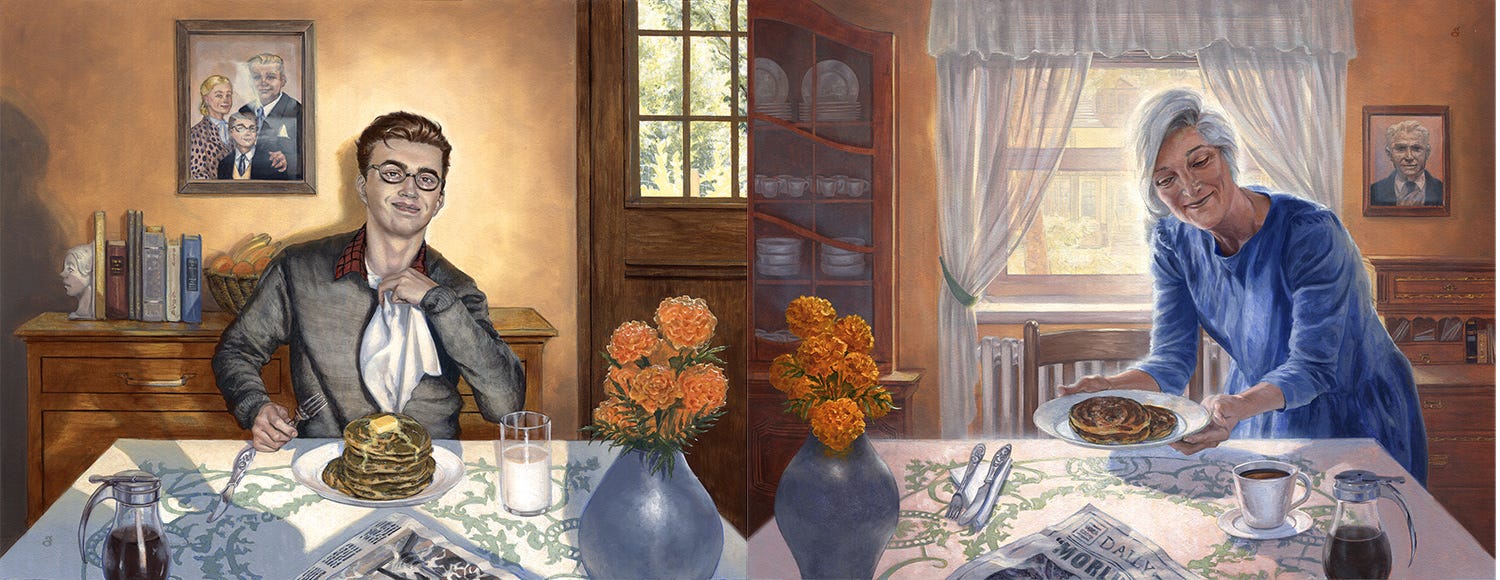
Had I known I was doing this months prior, I would have set things up to simplify matters, in my references. Here I began by flipping the orientation of the vase and syrup. The lighting then was decided as being head-on, since the window was now directly behind the viewer. The tablecloth and such provided further continuity here, and I even included Aunt May’s cast shadow, placing her own wheatcakes down from the other illustration—naturally she served Peter first. Another friend, roughly Peter’s age, posed for him, though I did have to also change up his hair and eyes a bit to conform to the intended portrayal. I imagine it’s occasionally disappointing for a model to learn that oh, the final only looks like you from the nose down!
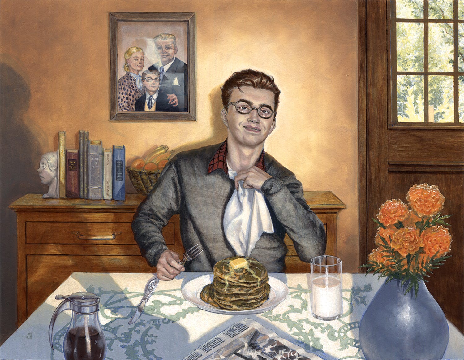
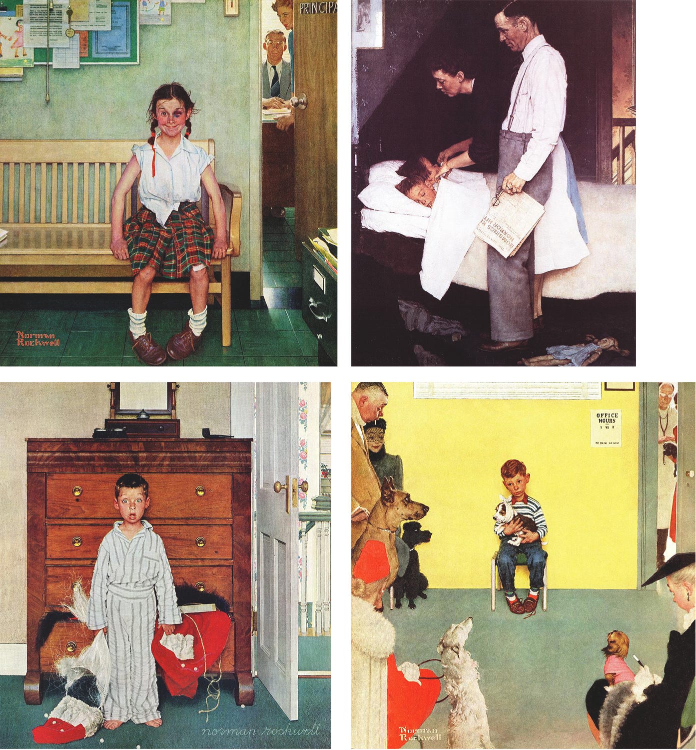
The flip side of Aunt May was an overt Rockwell homage. Here, while it has less of that, I did use a classic Rockwell compositional technique my college teacher Vincent Perez impressed upon me. I call it the shallow escape. There are a number of usually indoor scenes Rockwell illustrated, with very shallow stage depths, often front-on like this as he rarely painted interiors at any angle other than parallel. Because the stage is so shallow, and the walls typically parallel to the viewer, it can flatten out, so he frequently provided a visual escape along the left or right edge, but often the right, particularly if there wasn’t a window to allow the eye a deeper field of vision. Often minimal, it could be an open door way, stairs, a hallway, something that allowed the eye to escape further into the space after beholding the main scene. Placed on the right side as was typical when he used it, it allows our left-to-right scanning eyes to take in the scene and then, “escape,” out the composition. It’s an effective trick, and I utilized it here with the glass panes on the front door, giving you that depth into the yard and garden, also along the right side. Thanks again, Norman!