MTG: The Amazing Spider-Man (2024)
I Prepared My Whole Life For This
My own history with Spider-Man goes back to my youngest days. I’m actually not sure whether I knew the character more from comic books themselves or the daily syndicated reruns of the late 60’s cartoon. In those days, DC and Marvel weren’t divided into as firm camps to me as they later seemed. I enjoyed all these characters regardless of their publishing home.
As the years went on I migrated more to paint and fantasy art than comics, but those early influences never really leave. So, being able to marry my childhood fondness for these characters with my painted style was a very welcome experience. It also felt like a probably once-in-a-lifetime chance, for which I’m very grateful to art director Stephanie Cheung. I mean, I’d love to be wrong there, but I’ll keep those expectations low.
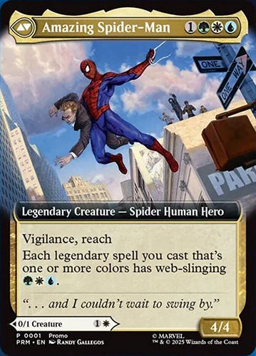
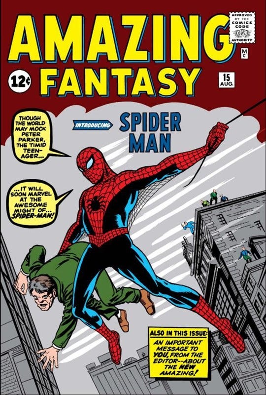
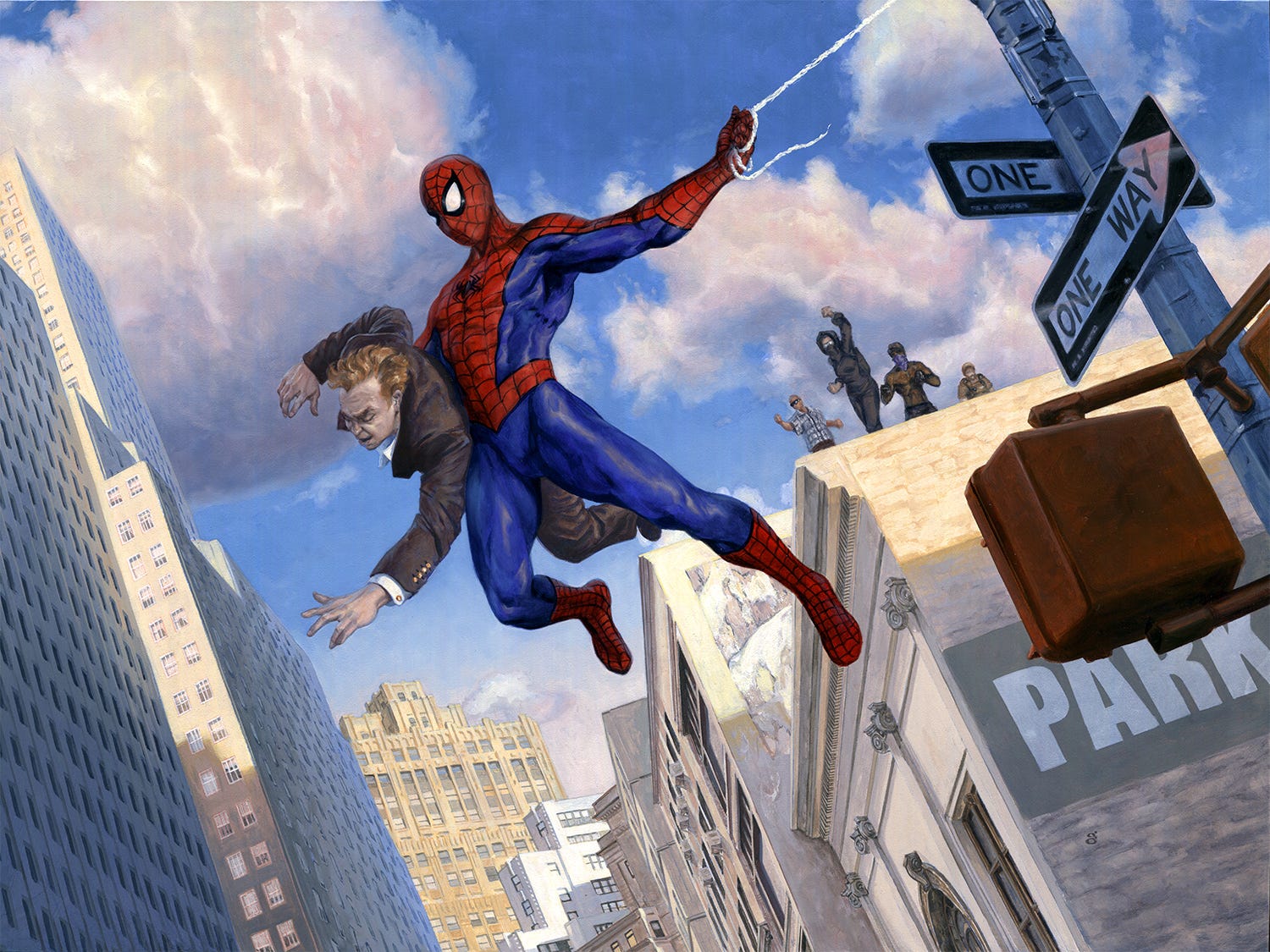
The upside of this illustration was also its downside. I was asked to create a composition inspired by the classic Amazing Fantasy #15 cover by Kirby/Ditko. I was free to update it a bit, and it was fun to do so. Living in NYC provided a lot of reference and feel for this, and all those buildings are NYC buildings, although I deliberately cut up and remixed the locations and placements of buildings, so that I could approximate the overall composition in the comic book, including the tall building on the left and the shorter one under his outstretched arm, with other baddies on the roof. The criminal being nabbed I had at first redesigned entirely, making him less of a white-collar criminal, but I was asked to hew closer to the character type, there.
While living in NYC, I had spent a little time working on a few urban landscapes, which got me a bit used to painting various building types, and as the series always featured the street signs on their poles, one was a natural addition here, although I didn’t put the street names for obvious reasons. This is just meant to be generically NYC, in the end. That pole also framed the action with the left building fairly well, as translating this from a vertical to horizontal composition required some consideration, as well as the tiny printed size.
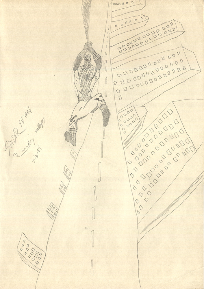
When the project was over, I thanked Stephanie for the opportunity and sent her a scan of the drawing I’m including here, which I did as a kid. She got a huge kick out of it.
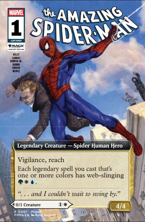
While it was more than enough to have had the honor of this assignment, it was a further surprise to see it printed as a variant cover to an official Marvel comic in association with this release (for promo distribution, only). That, I only discovered a few weeks prior to the set’s release.