Study After Elmore (1990)
Climbing up to the shoulders of giants, to try to stand
Today’s post is part of a free preview of the daily post. Most daily posts will be for paid subscribers as we roll along. I hope you’ll consider joining with a paid subscription to see new posts every weekday.
Well, here is a copy of a Larry Elmore illustration I did my junior year of high school, when I was 15. 15, ok? So be nice.
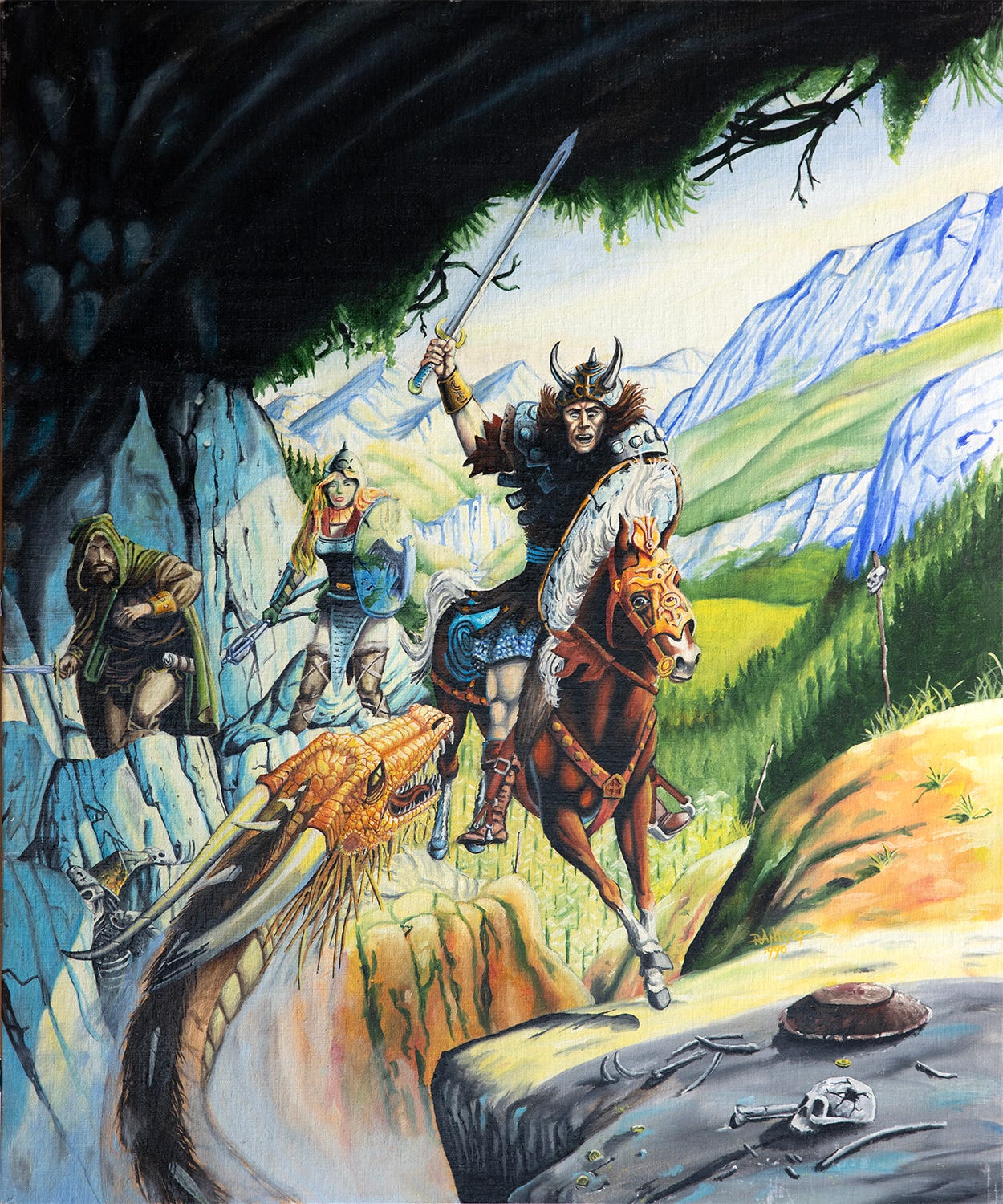
There are couple of things worth noting here. The painting was done on a 24x20" canvas board. I used oils, which were still pretty new to me at the time. I recall using nothing but odorless thinner the whole time, as a medium, and a packaged set of maybe 8 or 10 Grumbacher paints. I worked flat on my standard writing desk at the time. At that size, working flat produces some problems of perspective that I wasn't really aware of yet. Basically if you look at the picture, you'll notice that the rider is gigantor, and the horse must've been hurting. Particularly, the guy's head is mammoth. There are other cues, like the lady adventurer's head is skewed and elongated. Some of this can certainly be chalked up to inept drawing on my part. But, by way of example, let us suppose we are drawing a wicked-cool picture of a warrior fantasy dude, on a largish piece of paper, flat on a table, unaware of the issues. We would begin to compensate for the angle at which the paper is at, and draw it so it looks good from our particular angle. However, when you tilted it up, you would notice that towards the top of the page, you drew things unnaturally large by accident, because that part of the paper was further from you, and appeared smaller when you drew it at the original angle.
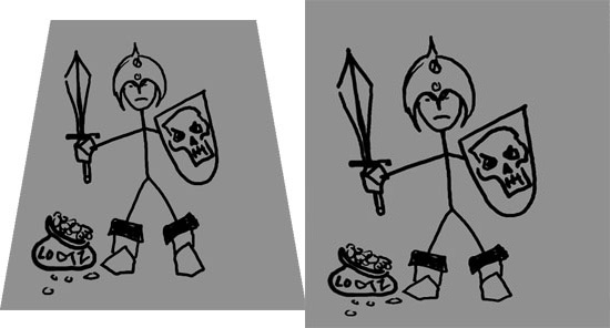
So, this tall, buffed warrior you thought you drew was actually a bobble-headed squat guy. This was done by drawing the image in Photoshop and then pulling the rectangle back to more or less straight.
So, let's revisit this Elmore copy.
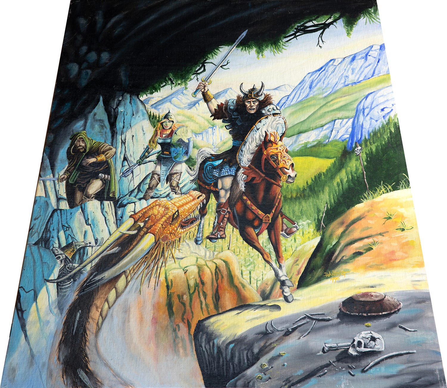
Yep, as suspected, by tweaking it to approximate the angle the image was viewed at while working on it, you see that the head shrinks considerably, and the whole thing generally looks a little better. You can see that the dragon at the bottom looks longer and larger in comparison. It can actually fit the rider's head in its mouth now. That doesn't help out the poor drawing in general, but makes the point that when at all possible, you should draw or paint so the image plane is perpendicular to your line of sight, especially as an image gets larger.
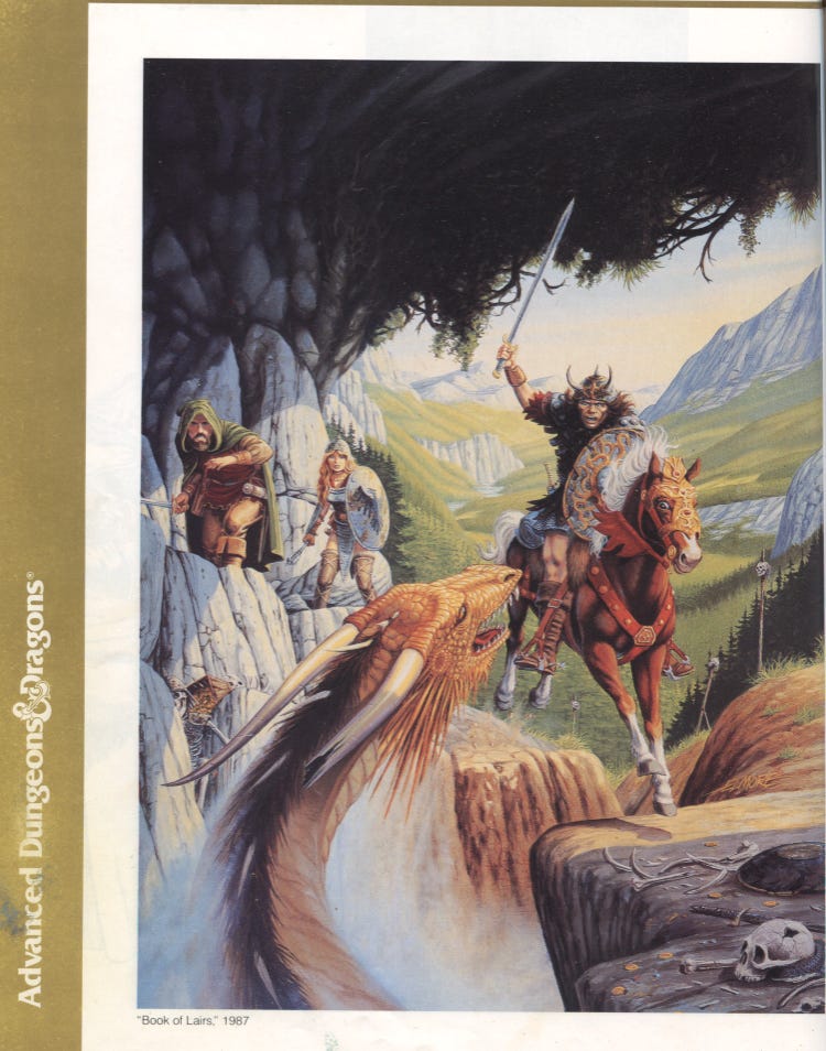
Many years later, but also many years ago now, I shot off an email to Larry Elmore with my image, explaining what he was seeing. I've had the pleasure of meeting Elmore a couple of times and chatting face-to-face and over email. He responded back appreciative, and commenting that he'd completely forgotten about the painting this was based on until he saw it here. I guess that'll happen after some 25 years or so (at the time)! In any case, a couple weeks later I saw that the image had been reprinted on an Italian magazine, and asked Larry's permission to post it around, which he was happy to grant. Since then, I regained access to the book I owned since high school: The Art of Advanced Dungeons & Dragons. So this is the page I copied from:
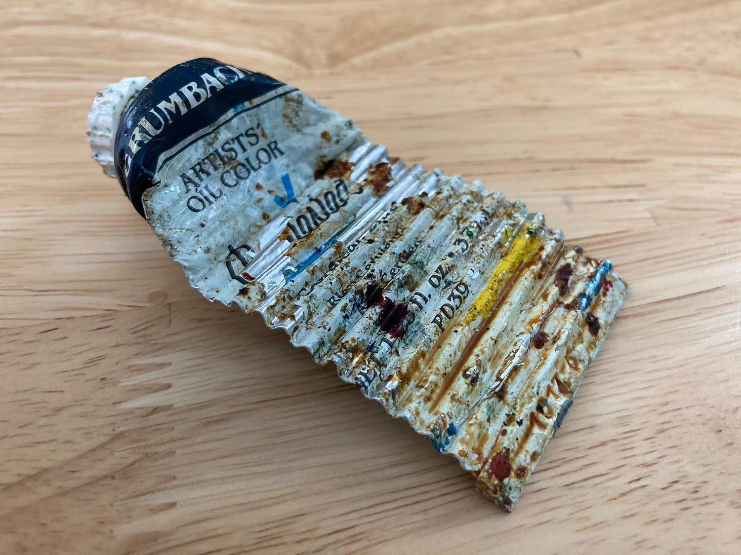
Bonus: That Grumbacher oil set was a Christmas gift to my older brother in like 1987 or so. He didn’t end up using it so I appropriated it as my first oil paints. The last tube from it was a tube of Cerulean Blue that I used through the early 2010’s. It was pretty hard by then already—I had to soften the paint by adding oil to it with a palette knife. I kept it as a memento.