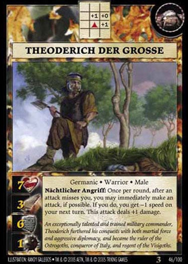
Theoderich der Grosse (2005)
A timely commission
This post is public, so feel free to share it. I hope you’ll consider joining with a free or paid subscription to see new posts every weekday.
I spent some of 2005 living in Italy, in the Tuscany region. It was a good time in a tiny village, and I continued working on projects in my very small and makeshift studio, including working on the bulk of my illustrations for the Anachronism game.
These assignments were usually handed out in fives: a character, an artifact, and some narrative or other scenes related to the character. For this suite, my work covered Theodoric the Great—the Germanic rendering of the name appeared in the official title of the card.
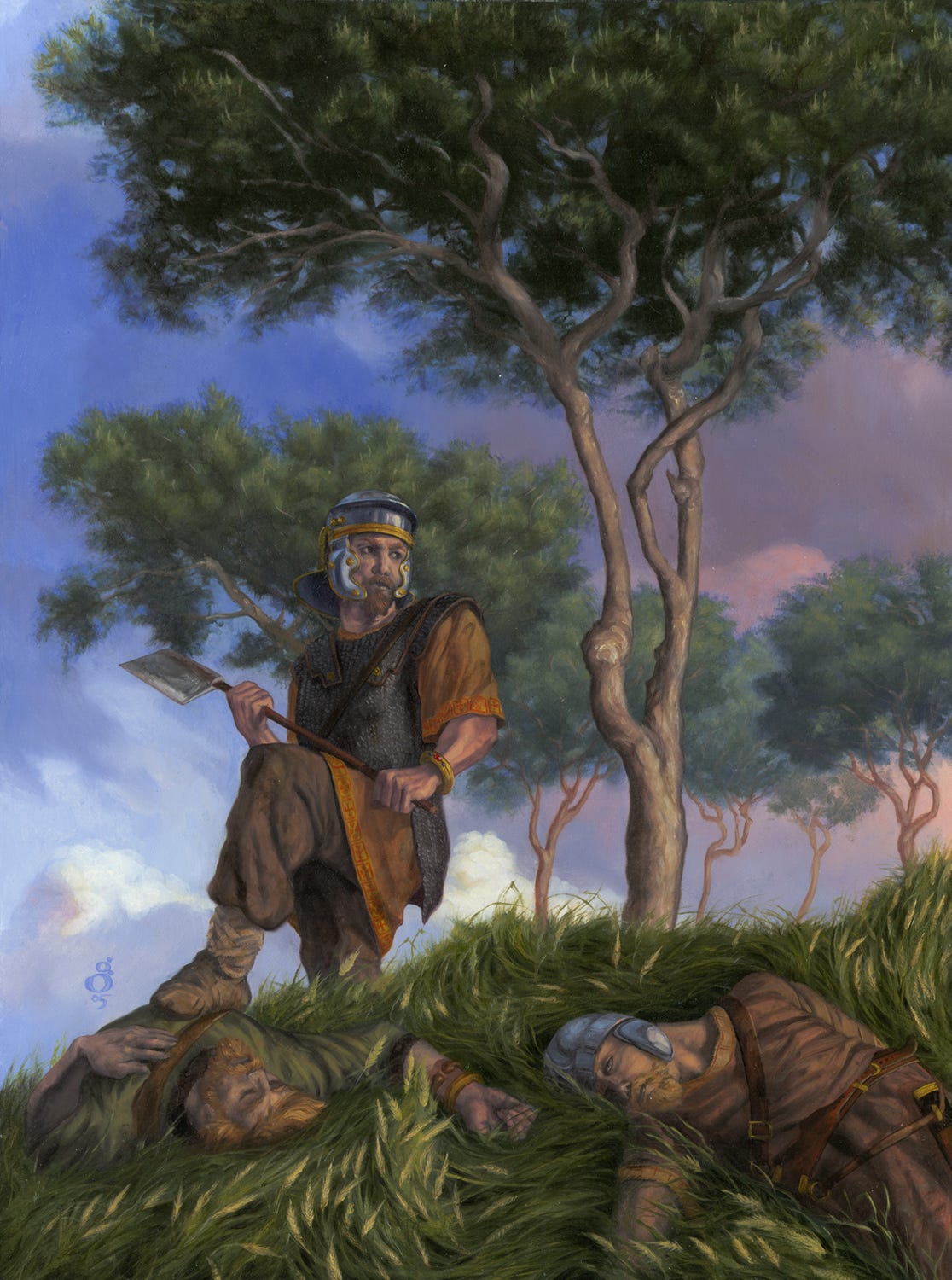
An Ostrogoth, raised in Constantinople and made ruler of Italy during the tumultuous 5c., his was the way of the conquerer, and this was portrayed in his namesake illustration, wherein I once again decided to employ my practice of painting way beyond the border of the printed image for no other reason than that I wanted to. Most players of the game would not see the full image unless they saw me show it here and there over the years.
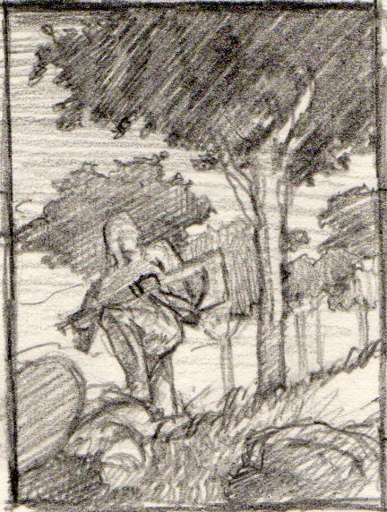
This was intended from the beginning, as seen in the thumbnail for this piece. Pieces of reference, including helmet, were surprisingly easy to find, I think I ran across this helmet at random while walking about Sienna or Florence and took some photos of it. It suffers from the survivorship bias of historical artifacts: likely there was decent variety among helmets, but what survives becomes thought to be something like industrially-produced and standard-issued.
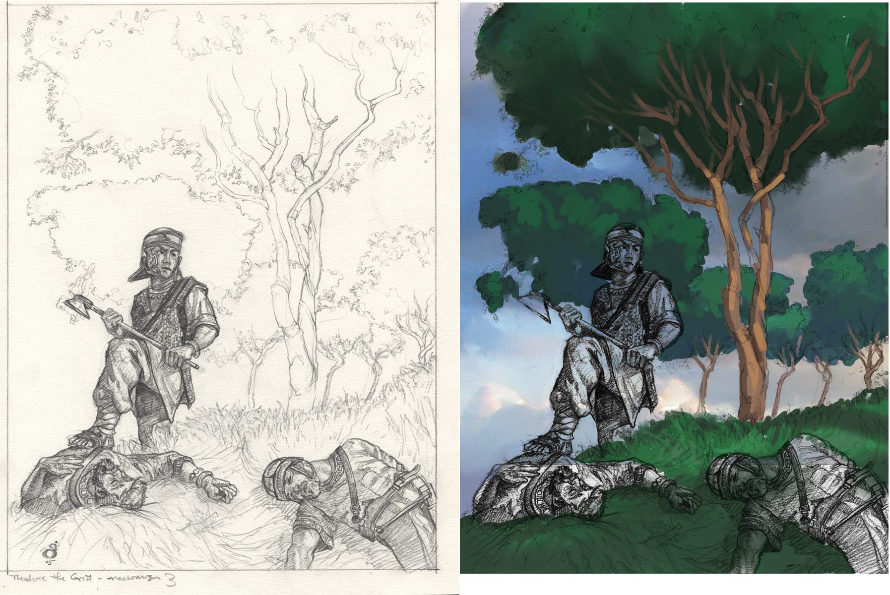
In more recent years, I’ve often done my pencil studies in two steps. In the above pencil study, the figure was probably drawn too small for my needs, but as I was showing the whole environment, the only option would have been to draw on a much larger sheet so that the figure could be right-sized for the detail I wanted. These days, I would draw the figure at the size I need, more often than not, and would draw out the background separately, then composite them digitally for use in the painting. I also produced a color study of the environment versus a black-and-white value study. It serves as both, but evidently I needed to see my path forward in color more than usual. You’ll note that I just digitally inserted the sky I was using, from the bank of photos I’ve built up when randomly taking pictures while out and about. I had to then physically translate that photo to paint. Digitally, one might just mush it around a bit with painting tools to make it look less photo-like.
The values of a painting (it’s balance of lightness and darkness) are always more important than the colors, in my opinion. If you reduce a color piece to black-and-white you’re left with the values and if they hold together the painting will generally hold together. Conversely, if the value study is good you can paint it in almost any rational palette and it will still hold together. For instance, I could have used a strong golden palettehere , but by keeping with the value study the painting would still read nicely. Here is a side-by-side comparison of the value study and the final piece, reduced to value.
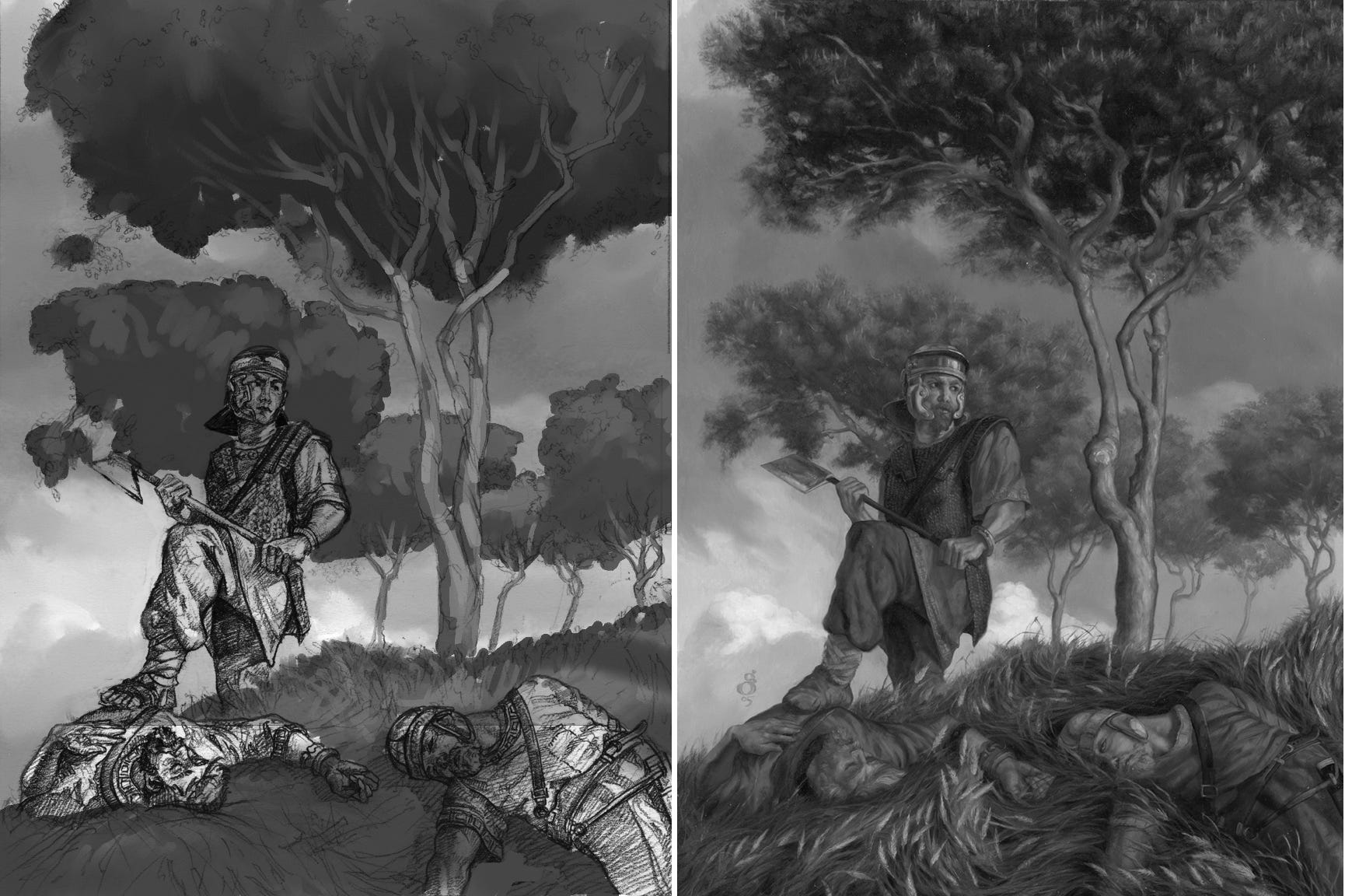
You can see that many things are exactly as planned. Other things were tweaked to improve readability—for instance, I pushed the further trees a bit back in the atmospheric perspective to give the piece a bit more depth.