

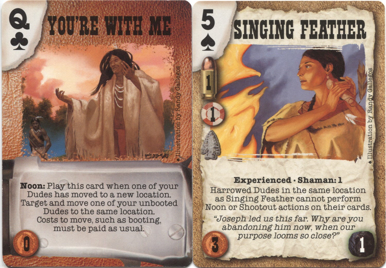
You’re With Me | Singing Feather (1998)
They double as poker cards
Today’s post is part of a free preview of the daily post. These free posts are ending soon. Most daily posts will be for paid subscribers as we roll along. I hope you’ll consider joining with a paid subscription to see new posts every weekday.
Wizards of the Coast, in the late 90s, created and published, or acquired or licensed a number of other card games. For instance, they at one point acquired Five Rings Publishing, which developed the Deadlands (later Doomtown) card game. So in those years I worked a little here and there on those different games.
It was a nice time for variety, since each of these other card games tried to carve out a definable thematic niche in the market. Here, we had an alternate history Old American West, a genre I hadn’t worked in before, and have only had one other opportunity to work in, since.
Working in this genre has evolved a lot over the years. By this time I was pretty interested in artists like Howard Terpning and Frank McCarthy, who were updating the prior media stereotypes of Hollywood with better researched and more respectful visuals. Usually, succeeding in the fine art market required better research and eventually, good familiarity with the wide range of dress and decoration used between tribes.
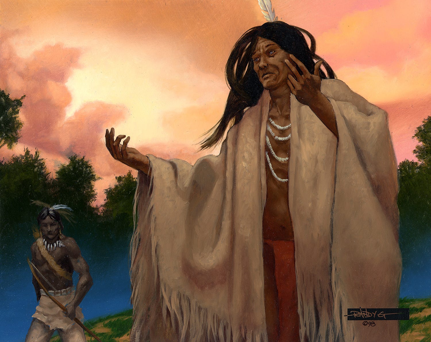
So, dipping a toe into the genre temporarily is a fraught matter. In this instance, I was asked to re-illustrate a character I had painted for an earlier release in this game, “Joseph Eyes-Like-Rain.” There is mist in the distance that takes the trees in shadow to a vibrant blue. It’s interesting to see, years later, since this is a move I’d scarcely make these days, and I couldn’t tell you exactly what in my evolving aesthetic would prevent it.
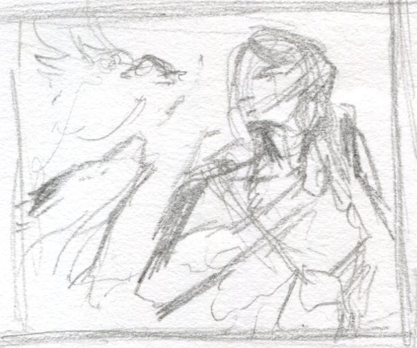
I’ve changed the way I do thumbnails many times over the years. Early on they were frequently of this nature: hastily scribbled and small, but enough to give me the gist of the composition. For many years doing thumbnails was the worst part of the job for me. So I changed up my approach a few times since as any illustration instructor will tell you, thumbnails are super important, and generating multiple options is key to finding a solution that’s successful.
Over time my thumbnails, as will appear here frequently, have become a bit more detailed. Still small, but with more information packed into them, primarily in indicating dark and light shapes (value structure). Because they are “nicer” in comparison to these earlier ones, I also keep them more often. It wasn’t uncommon for me to just junk my thumbnails, so this is an unusual one I still have from that era.
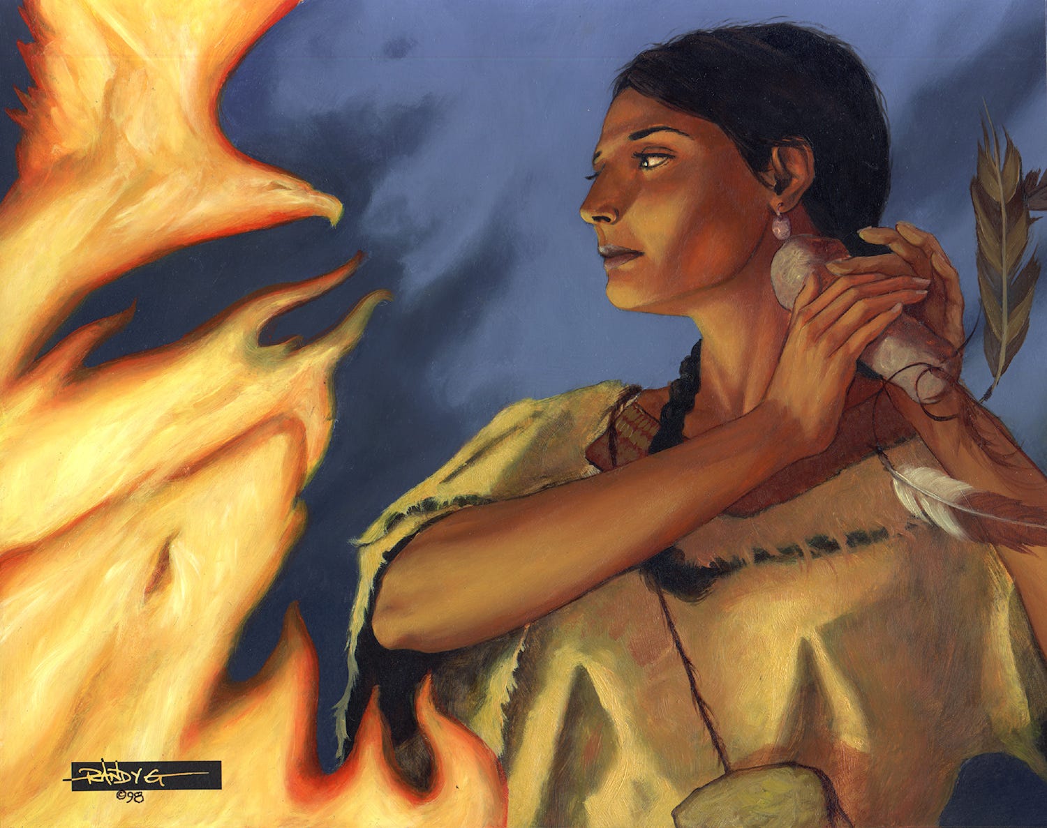
The idea here was to indicate wolf and eagle spirits in the fire. Clearly here I was more interested in developing the figure.
My signature block on both of these paintings was used for about 5-6 years until I developed my “g” sigil in 2003. It is actually a rub-down transfer graphic. These black transfer sheets were in common use with graphic designers before computers revolutionized that industry. I had the “RANDY G” I had used in my earliest years designed as a vector file on a black bad, with the portions that break the box being reversed out to black. I had multiple sizes of these to accommodate different sized paintings printed on a sheet, and would transfer one to the surface of the painting. The year would typically be written in extra fine Sharpie in this configuration of my signature, and the varnish placed over it.